Exploring the Evolution of Kirby's Image: From "Angry Kirby" to Global Consistency
This article delves into the fascinating story behind Kirby's differing appearances in Western and Japanese markets, drawing on insights from former Nintendo employees. We'll examine Nintendo's localization strategies and their impact on the beloved pink puffball's image.

The "Angry Kirby" Phenomenon: A Western Marketing Strategy

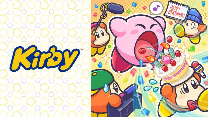
Kirby's portrayal on Western game covers and artwork often featured a more determined, even "fierce," expression, a departure from his typically cute Japanese counterpart. Former Nintendo Localization Director, Leslie Swan, clarified that the goal wasn't to make Kirby angry, but rather to project a sense of determination, a quality perceived as more appealing to Western tween and teen boys. This contrasts with the Japanese market, where Kirby's inherent cuteness is a major draw, as noted by Kirby: Triple Deluxe Director Shinya Kumazaki. While acknowledging the effectiveness of a "tougher" Kirby in the West, Kumazaki emphasized that the approach varied depending on the game.
Marketing Kirby as "Super Tuff Pink Puff": A Shift in Nintendo's Image

Nintendo's marketing strategy aimed to broaden Kirby's appeal, particularly among boys. The "Super Tuff Pink Puff" campaign for Kirby Super Star Ultra exemplifies this approach. Former Nintendo of America Public Relations Manager, Krysta Yang, highlighted Nintendo's desire to shed its "kiddie" image, emphasizing the negative perception of games labeled as such. This led to a conscious effort to portray Kirby's combat abilities more prominently, aiming to attract a wider age range. While recent marketing has focused on gameplay and abilities, rather than personality, Kirby's inherent cuteness remains a dominant perception.
Regional Variations in Localization: A Case Study

The differences in Kirby's localization extend beyond facial expressions. The original Kirby's Dream Land (Game Boy) featured a ghostly-white Kirby in its US release, compared to his pink counterpart in Japan. This decision, driven by the Game Boy's monochrome display, created an unintended challenge. The subsequent release of Kirby's Adventure (NES) revealed Kirby's true pink hue, making the earlier decision a point of discussion. This experience contributed to Nintendo of America's decision to adjust Kirby's facial expressions in subsequent Western releases. In recent years, however, a more consistent global approach has emerged.
A More Global Approach: Consistency and Challenges

Both Swan and Yang agree that Nintendo has adopted a more globalized strategy, fostering closer collaboration between its Japanese and American offices. This leads to more consistent marketing and localization, minimizing regional variations like those seen in earlier Kirby box art. While this promotes brand consistency, Yang notes a potential downside: a tendency towards "bland, safe marketing" that might overlook regional nuances. The current trend towards global consistency is also attributed to the industry's globalization and the increasing familiarity of Western audiences with Japanese pop culture.


